While this blog has definitely been ignored for a few years now, squeezed between the instant gratification of Twitter, the friend-notification of Facebook, and the richer experience of YouTube, there are still things worth sharing that don’t fit into any of those buckets. Here’s one.
I try to stay healthy these days, and while I’m not losing weight (I could lost a few kilos) I’m not gaining it either. One thing that helps a lot is knowing how much sugar, fat and nutrition is in the food I eat, and that’s something that’s much easier here in Australia than in the US.
Almost every food item sold in a supermarket will have a nutrition information panel, and that’s true in the US and here. However, in the US, the information is only given as an amount within an arbitrary serving size, which is different for each food, with a far more prominent percentage of a “Daily Value” which may or may not be correct for you.
With something like a burger patty, sure, a serving size makes sense. But for many foods, it doesn’t. Serving sizes are picked to make the other numbers look better, often useless unless you weigh your food, and
The only easy way to compare two foods is with percentages, because it’s true for any amount of food, and gives you a quick way to judge if a product is healthy or not by using rules of thumb like “avoid foods with greater than 3% sugar”. Providing nutrition info per 100g is a great way to do this, and Australian nutrition guidelines must include it. Therefore, imported products place stickers over the original nutrition info, like this:

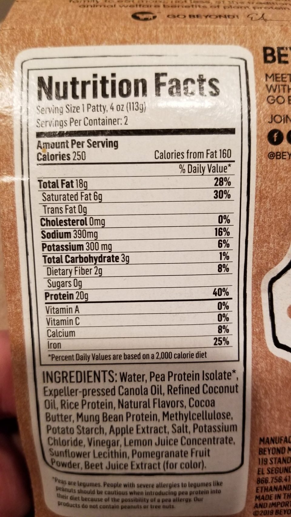
Now it’s all pretty clear, there’s 15.9% fat in Beyond Burgers. (That’s not unusual for veggie burgers, but about triple the fat of the extra lean mince I prefer if I’m eating regular meat burgers.) That’s not clear from the US packaging unless you’re really good at mental arithmetic (18g/113g).
Here’s another example of two different cereal products. Neither are particularly healthy, but can you quickly tell which has more sugar?
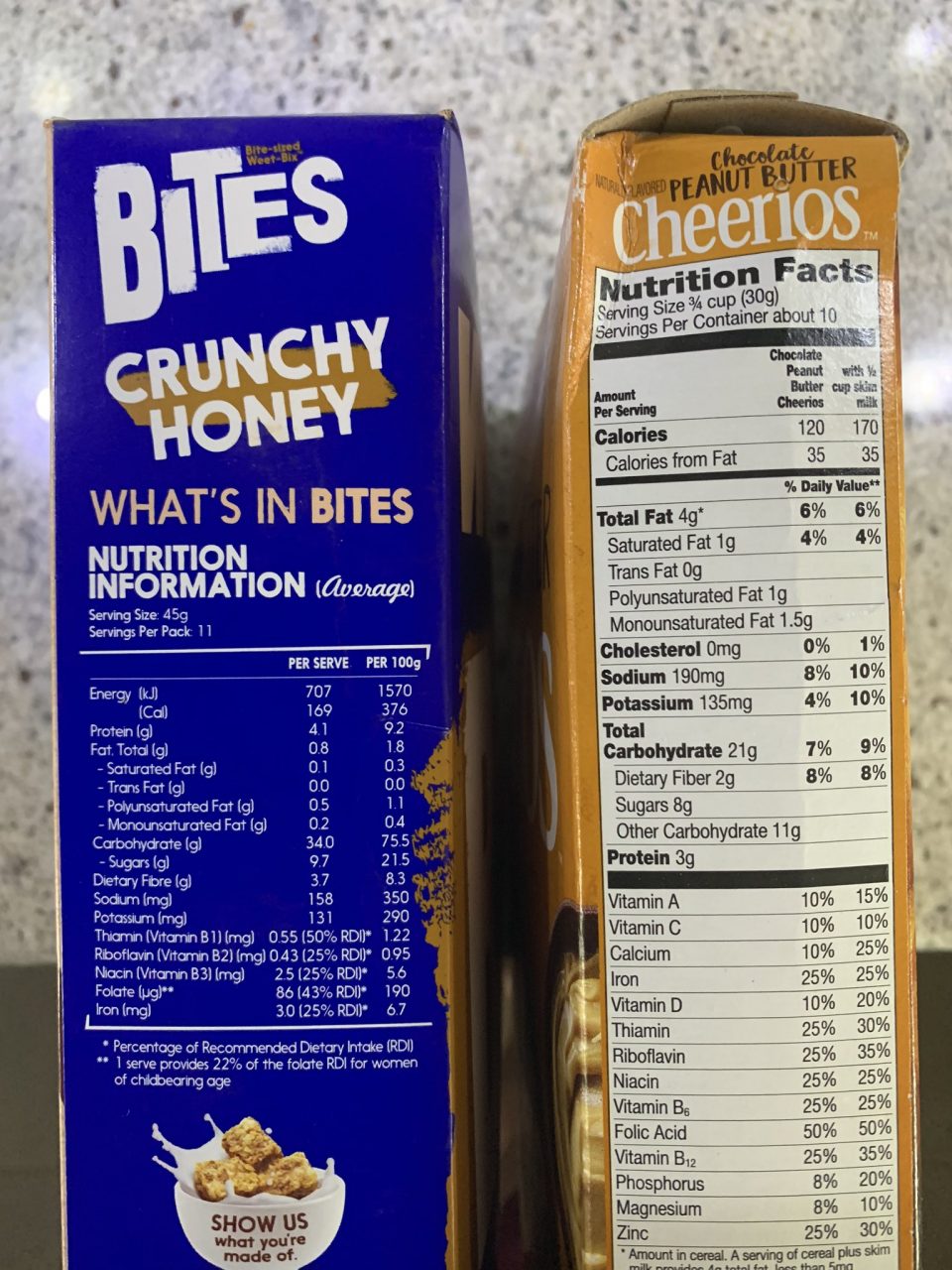
The Australian cereal on the left is 21.5% sugar, easy to read from the 100g column, while the US cereal on the right is 26.6% sugar, which you need maths (8g/30g) to figure out.
Including a “per 100g” column on all products in the US isn’t going to turn around the obesity epidemic it’s facing; Australia (and the UK, and many other countries) have similar issues. But it would be a really helpful start, because the actual information is currently very well hidden indeed.